An Introduction to Graph Theory, Using Gephi
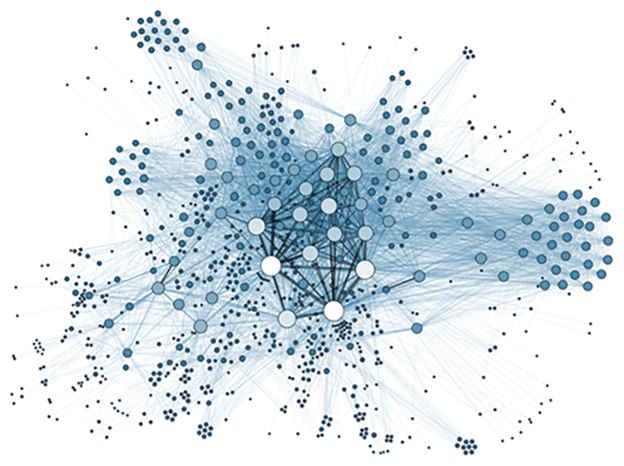
Credit: Martin Grandjean, Social Network Analysis
Author: Ali Zaidi
Have you ever wondered how Google Maps works? How does the application calculate the fastest route for you, and how does it do this so quickly? The answer might surprise you – at the backbone of these navigational applications and software is graph theory.
Graph theory encompasses the study of how different things connect using mathematics, and was first studied by famous mathematician, Leonhard Euler.
Euler introduced the idea of graph theory after he encountered the Königsberg bridge problem. You can see an image of the bridge below from Euler’s paper Solutio problematis ad geometriam situs pertinentis, published in 1741.
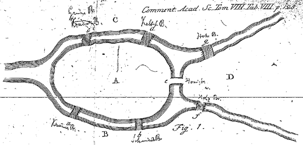
The city of Königsberg had seven bridges, which connected four bodies of land. The problem involved finding a way to traverse these bridges in such a way that a person could cross each bridge just once and return to the point of origin. After walking the path, Euler made a vertex, or node, as it is referred to in current graph theory, wherever there was a body of land. He marked each bridge that connected the two bodies of land as an edge, also known as a connection between vertices. (To relate this to Google maps – it would be similar to placing one vertex at your current location and one at your intended destination, with the edge being the route between those points.) By placing vertices and edges on the bridge, Euler was able to understand that the bridge problem was unsolvable – it was impossible to accomplish this task in the way it was designed.
However, Euler was able to propose a generalization of his solution. He stated that if there are more than two landmasses and an odd number of associated bridges – there is no way to go through each bridge just once and return to the starting point. If there are an odd number of bridges between two land masses, then if you start in one these of these landmasses you can complete the journey. This constituted the beginning of the eulerian graph. From here, Sir William Rowan Hamilton developed the hamiltonian graph. Later, advancements in graph theory led to the development of trees, which are ubiquitous in modern day Computer Science.
From Euler’s solution, current graph theory was developed and expanded upon. We can use the nodes and edges that Euler first described to model complex relationships and develop solutions like the one Google Maps uses. In Google Maps, we place a node every time there is an intersection, stop sign, traffic light, or other point of interest that we would like to model. From there, by connecting these nodes together using edges, we can use graph theory to find the shortest number of edges needed to traverse two nodes. Other interesting applications of graph theory include modeling and understanding Nigerian scammers, social media, investing, and more.
Today, we’re going to look at how we can use Gephi, an open-source network analysis visualization software tool, to model the famous French novel Les Misérables by Victor Hugo. Gephi allows us to visualize, filter, and analyze networks with a variety of in-built statistical techniques. We can use graph theory to model the relationships between each character in the novel. Every time we see two characters interact, we’ll note that interaction as an edge and the characters as the vertices or nodes. We can use the network graph results to better understand the character interactions and identify the most important characters. Without even reading the book, I can use network theory to figure out which characters are most likely the main characters based on the diversity of character interactions.
Let’s start by downloading Gephi – you can do so using this link. Once Gephi is downloaded, launch the application. You’ll get a starting screen that looks something similar to this:

Today – we will use the Les Miserables.gexf file that is already loaded within Gephi to make it easy to use today’s tutorial. Under Samples on the screenshot above – you can see that we have three options. Click the ‘Les Miserables.gexf’ file.
We will then get a screen that looks like this.
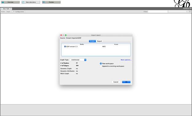
Here we will be able to change the way that Gephi reads in the data if we want to. For now we will keep the default options and then hit ‘OK’. Let’s understand what is written above – the two important pieces of information involve the ‘# of Nodes’ value and the ‘# of Edges’ value. The nodes are the characters in Les Misérables and the edges are the interactions between them. Once we’ve loaded in the data, click the Overview tab at the top to get an interactive view of the network.

This looks good, except we have no idea what the labels on our nodes are. Let’s change that by clicking the grayed-out T at the bottom of the graph window. Adjust the font size and boldness by clicking the options to the right of the T.
After we go to the Overview tab and make these changes, we see that the largest node is of the main character, Jean Valjean. This makes sense as we would assume the main character of a novel has the most interactions with other characters in the same novel. We can also identify other important characters using this method without having read the book.
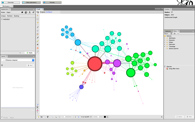
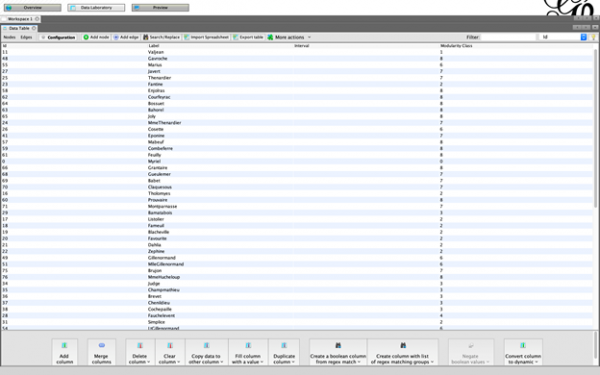
To look at our data, click the Data Laboratory tab on the top of the screen, and you’ll be able to access a screen that looks like the image above. This shows us the different nodes that represent each character from the novel. The edges are of varying thickness, signifying how often the characters connected by that edge are seen interacting. The thicker the edge, the more those two characters interact. We’ll also see that many characters never interact with each other.
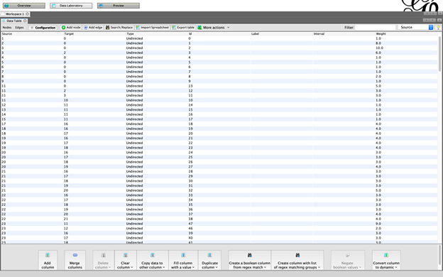
If we click the Edges tab in the top menu, we’ll get a view showing us the edges in our data. We can add, delete, or search for specific nodes or edges using this Data Laboratory view.
How can we analyze the data? Let’s start by filtering our nodes such that we only see characters that interact with 5 other characters. Go back to the Overview tab. Now click in the Filters pane and click on Topology. There should be a drop down that will allow you to drag the Degree Range filter into the queries section below.
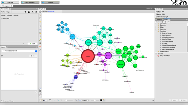
After you have dragged the Degree Range filter into the Queries section and hit the filter button, you will get a slider that looks like this. This slider allows you to adjust which nodes you want; currently we are seeing every node from our data. If I raise the slider from 1 to 10, then I will see all nodes where each node had at least 5 edges with other nodes.

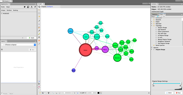
We see that the graph we have now is much smaller than the original. It’s likely that nodes that touch a lot of other nodes will be characters that are more important.
Lastly, how can we gain statistical insight from our graph? In the side bar, click the Statistics tab. I can calculate the average path length, or length of the edges using the Statistics tab. If we were mapping a dataset of geographic points instead of a novel, we could calculate the average distance between the nodes and create a very basic version of Google Maps.
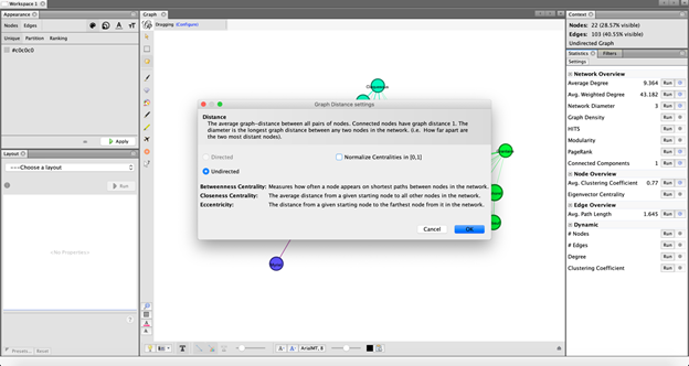
Using network analysis and graph theory can help model the relationships around us, regardless of the type of data or problem we’re working with. The applications are limitless, extending to literature, finance, geographical data, and more. In this example, we saw how to use graph theory to model the relationships in the novel Les Misérables, by Victor Hugo. Without having read the novel, we are able to analyze and identify the main characters, filter the characters based on their number of interactions with other characters, and calculate the average path distance between characters.
What do you want to graph? The world is yours with Gephi and similar tools like Cytoscape, Graphviz, Visjs, Mermaid, and NetworkX.
© 2021 The MITRE Corporation. All rights reserved. Approved for public release. Distribution unlimited. Case number 21-1107
Ali Zaidi is a data scientist at the MITRE Corporation. He specializes in machine learning and helped launch MITRE’s Generation AI Nexus program. He has an MS in Data Science from the University of Virginia.
MITRE’s mission-driven teams are dedicated to solving problems for a safer world. Through our public-private partnerships and federally funded R&D centers, we work across government and in partnership with industry to tackle challenges to the safety, stability, and well-being of our nation. Learn more about MITRE.
See also:
MITRE’s Pearls of Expertise at FIU ShellHacks
Enhance Your Data Science Toolkit: Add-Ons and Updates to the Most Commonly Used Tools
Interview with Ali Zaidi on Designing Lessons in Artificial Intelligence
Coming Back to Make a Difference, Find a Passion, and Change the World
Mentoring the Workforce of the Future: The Emerging Technologies Summer Student Program
Artificial Intelligence Helps MITRE Save Lives During the Pandemic
The Road to Resilient, Sustainable Infrastructure Is a Smart One
The Power of Geospatial Data In Developing Countries
Dr. David E. Willmes on Solving Global Food Insecurity
When AI and Psychology Meet, Insights Emerge
Creating an AI-Savvy Workforce for a Strong Future
MITRE’s Pearls of Expertise at FIU ShellHacks
Interview with Dr. Michael Balazs on Generation AI Nexus
The World as It Will Be: Workforce Development Within and Beyond MITRE
Mist Computing: Everything Computing Everywhere
Internet of Things Security: Challenges and Solutions
5G: How it Works and What it Brings
Will Quantum Computers Revolutionize My Daily Life? Not in the Ways You Might Think
The Person at the Other End of the Data
A Social Scientist Examines the Role of Technology in our Lives
