So You Want to Think Like a Data Scientist? The Importance of Visualizations in the Data Science Workflow

Credit: Lukas
Author: Ali Zaidi
Although the moniker data scientist implies that the role centers around manipulating data and modeling it, visualizing data and creating visualizations are an integral part of the daily workflow for practicing data scientists like me. Not only do visualizations allow us to communicate results quickly and efficiently, but visualizing is a key tool during exploratory data analysis, data cleaning, modeling, and other steps of the process of telling stories with numbers.
The two programming languages that are most associated with data science are Python and R, due to the development of robust coding libraries. These libraries are collections of re-usable coding short cuts that can be imported and that data scientists—and learners—can use to save time and simplify complex operations.
Some of the most recognizable libraries in Python for visualizing code include Matplotlib, Bokeh, GGPlot, and Seaborn. Although many of these libraries enable similar types of graphing, each has its pros and cons in terms of how much code is needed to produce different visualizations, the aesthetics of the visuals, and the type of visualizations that can be created.
To get an understanding of how we can use these libraries to simplify the visualization process, I’ll present some examples in Python using the Seaborn package. Feel free to follow along—I recommend using Google Colaboratory to avoid the complexities of downloading Python on your PC. Create a new notebook to get started, and just copy or type the code you see below and hit the play button on the left of your cell.
Seaborn Visualization Example
The Seaborn package has some built-in datasets that you can load and use when you are connected to the internet. We’ll use the Titanic dataset to get an understanding of how a data scientist might choose to show readers or other stakeholders which passengers survived, and possibly ascertain the trends we see for those who survived versus those who perished.
The first step is to load the data into Python. Follow along by typing this code into a cell:

Hit the play button on the left and you’ll see the following table get outputted below the code.

We’ve now created a variable called ‘titanic’ and put all of the data from the Titanic data into it. We then outputted the first 5 rows of the dataset using the .head() command.
As a data scientist, the key to working with any dataset is understanding the big picture of what each column contains, the type of data, and the possible values for that column. The type of data we have in a column will limit the types of graphs and visualizations we can create. I’ll explain more about this further down through examples.
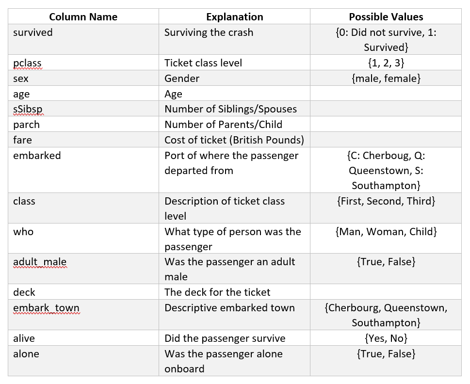
You might have noticed that there are a few quirks to this data that we’ll have to keep in mind. An important one to note is that we have the ticket fare price, or the cost of the ticket the passenger paid, in British Pounds – but it’s the price in British Pounds from 1912. When we work with historical financial data, monetary inflation applies, so we can’t directly compare the fare price from this data to current prices without a conversion. These quirks are a characteristic of data in every domain, and that’s why knowing the domain is extremely important as a data scientist.
Visualizations can be used in a lot of the steps in the data science process:
- Cleaning data is an extremely large aspect of the data science process. Cleaning refers to the process of modifying and removing data to make it more suitable for analysis. By removing, editing, or combining variables, we’re creating stronger data that will give better, more accurate models. We’ll see an example of how to do this below.
- Visualizing the data allows us to understand what trends are present after cleaning the data. How can we use these trends to either make further edits to the data or home in on certain variables and discard others? Do we have outliers present in the data that need to be removed?
- Modeling the data can use visualizations to understand model performance. Data science requires a lot of experimenting with different models, and we might want to visualize how well these models did with differing parameters and options to pick the best model.
Let’s begin by making some visualizations to understand what’s in our dataset.
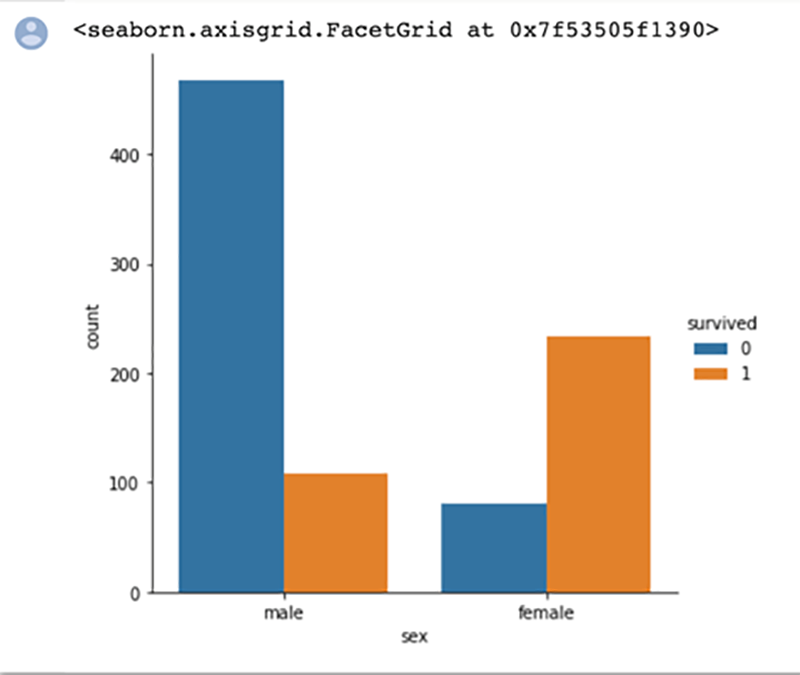
Here we do a simple count plot to understand the difference in genders for survival rate. The bar chart visualization quickly helps us identify that many more males perished than survived, and more females survived than perished. We also quickly identify that there were more males on board than females.
As I mentioned before, the type of data you have will determine what type of visualization can be created. Bar charts are valuable when trying to quickly understand categorical variables, variables that can only hold a value from two or more categories without any ordering. This can get somewhat confusing when it comes to categories that are numbers, but we can see an example of this with the pclass variable in the Titanic data. The possible values for this variable are 1, 2, and 3, although these numbers relate to categories of class instead of actual numbers like the fare variable.
You can read more about what types of data you need for different visualizations here.
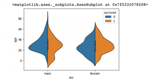
In contrast, violin plots allow us to see the distribution of a numeric variable across a categorical variable. Here we see how age, a numeric variable, is spread across both genders. We’ve also colored the violin plots to understand which passengers of each gender survived, and which did not. This chart very quickly tells us that more younger males survived than older males. In contrast, we quickly understand that the number of females who survived was about the same across the ages; there isn’t a significant trend to distinguish between females who survived in the different age groups.
Now let’s show how we can combine and visualize a variable.
The sibsp variable, which denotes the number of siblings and spouses onboard, and the parch variable, which denotes the number of parents and children of the passenger that are onboard, can be combined. By combining the two, we can create a new variable that can provide more insight than either of the separate variables into how family size impacted survival rate.


Do you see the new column called “family size”? Let’s see if there’s any relationship between age and family size, and color by whether the passenger survived or not. What you see below is a categorical scatterplot, which allows us to compare a categorical and numerical variable. Family size is the categorical variable and age is the numerical variable. We can see that the maximum family size is 8. The color coding shows us the passengers who survived: blue for those who didn’t survive and orange for those who did.
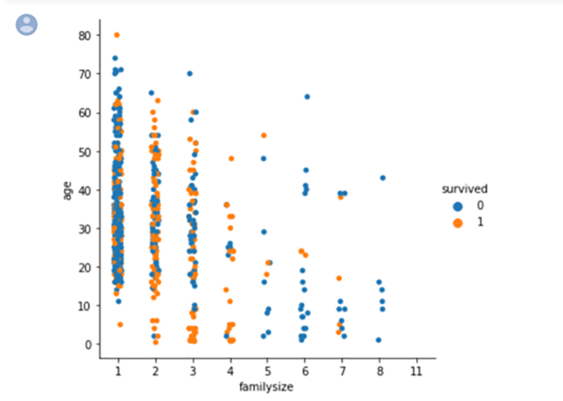
We see an interesting result. Passengers with the family size of 2-4 people seemed to have the best survival chances; as the family size grew the survival rate generally decreased.
As a data scientist, you’ll want to think logically through which types of variables might show a relationship. Sometimes you have to test multiple combinations of variables without any expectation of a relationship, and sometimes you’ll use some logical inference based on your past experience or knowledge. For example, I might logically expect those in first class to survive more often than the passengers in third class, as the wealthier passengers might have been prioritized.
Let’s test if that theory is correct with another categorical scatter plot, but this time we’ll look at age and class, and see which passengers survived.
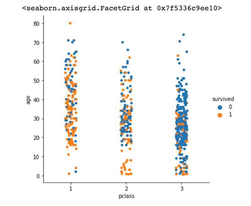
We can see a lot of orange dots in the first-class section in comparison to the third-class section, which confirms the logical inference that wealthier passengers survived more often than passengers in the lower classes.
There are a lot of considerations to make when you think like a data scientist to visualize data—and share what you’ve learned. You have to remember that to tell a story with the visualizations, you must understand the underlying data. With the Titanic dataset, we had to understand the complexities with each variable we had. By combining the child/parent and spouse columns, we were able to get more insight than if we had used those columns separately. There are a lot more considerations needed to fully gain the potential of the visualizations and a lot more math and statistical knowledge that goes into finding the optimal variables for analysis, but I hope this walkthrough allowed you to think like a data scientist.
Ali Zaidi is a data scientist at The MITRE Corporation. He specializes in machine learning and helped launch Generation AI. He has an MS in Data Science from the University of Virginia.
©2020 The MITRE Corporation. All rights reserved. Approved for public release; Distribution Unlimited. Case number 20-2935
MITRE’s mission-driven teams are dedicated to solving problems for a safer world. Through our public-private partnerships and federally funded R&D centers, we work across government and in partnership with industry to tackle challenges to the safety, stability, and well-being of our nation. Learn more about MITRE.
See also:
Getting Students Excited About STEM (and MITRE), with Willie Hill
Is This a Wolf? Understanding Bias in Machine Learning
Building Smarter Machines by Getting Smarter About the Brain
Technical Challenges in Data Science
Upgrading Machine Learning. Install Brain (Y/N)?
When AI and Psychology Meet, Insights Emerge
Creating an AI-Savvy Workforce for a Strong Future
MITRE’s Pearls of Expertise at FIU ShellHacks
Interview with Dr. Michael Balazs on Generation AI Nexus
Interview with Dr. Philip Barry on Blending AI and Education
Interview with Ali Zaidi on Designing Lessons in Artificial Intelligence
The World as It Will Be: Workforce Development Within and Beyond MITRE
