
Knowledge Visualization Part 4: Tips and Tools

Photo by picjumbo.com from Pexels
Authors: Diego Velasquez and Josef Kauzlarich
To recount where we’ve been thus far: Our first post on knowledge visualization built the case for why organizations should put significant thought into how their products will be received by their customers. The second post deconstructed some barriers individuals put up that tell themselves they are not creative or visual. The third post focused on how individuals conduct visual queries and what this means for visual design. With this fourth and final post, we’d like to provide you with the process we use to visualize content, a few practical tips, and some zero-cost tools to assist you with various stages of the knowledge visualization process.
The Knowledge Visualization Process
We have developed and executed our own knowledge visualization process within MITRE on many projects for the past four years and believe it has resulted in enhanced knowledge transfer (at least we have many people on record saying it did). 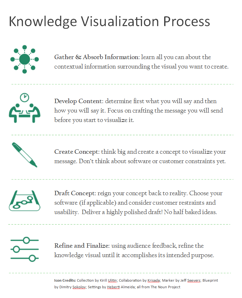
There are two things you should know. The first is to realize that applying the principles expressed in this framework requires practice. Knowledge visualization is a personal ability that must be nourished over time. Second, realize that the full process takes time to do correctly. If you are jumping fresh into a project that has been running for a while, it will take you some time to get up to speed so that you can be effective at knowledge visualization (even if you are good at visuals). It requires a deep understanding of the knowledge being transferred, an understanding of the customer or audience, and critical thinking to arrive at the best visual. With this understanding, it is also important to recognize that often there isn’t enough time to go through this full process. Sometimes the pressure of a delivery schedule gets in the way of doing this right. However, this doesn’t mean that there isn’t room for enhancement. Understanding which aspects of this process you can skip or speed through takes experience; so, jump in, experiment, and have fun!
Tips
In the hope of seeing more people (like you!) take it upon themselves to develop beautiful and impactful visuals, we compiled a list of six tips along with examples, which can be applied quickly to the vast majority of deliverables we’ve seen.
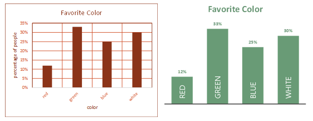
Tip 1 | simplify graphs
Microsoft Office products’ come with several anti-minimalistic design features in their graphs such as borders, grid lines, and multiple axes – eliminate the non-essential features and integrate the others.
Tip 2 | be bold and direct
Be bold with your visuals and direct with your text. In many cases, it may be appealing to enlarge your pictures to the entire size of the page. Then, concisely type your message on top.

Tip 3 | use the optimal line of length
Improve readability by keeping your lines between 50 and 75 characters – including spaces. If the lines are too long, it is difficult for a reader to focus. If the lines are too short, the lines break the reader’s rhythm due to traveling back and forth too often. Also, consider the vertical distance in between lines. A little extra space in between those lines can go a long way towards making it easier to read.
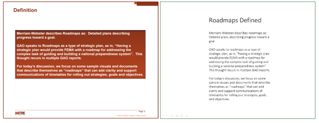
Tip 4 | maintain white space
White space on the page or slide improves legibility, increases attention, and improves comprehension by almost 20%. When you give your documents large borders and ample space between objects, you focus the reader’s eye on key content.
Tip 5 | eliminate unnecessary effects
Microsoft Office products’ come with several unnecessary effects (e.g., shadows, borders, 3d effects) in their objects that overwhelm readers. Better to eliminate the noise. When used sparingly, these effects can add style and emphasis. Often, they serve only as a distraction. 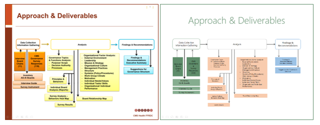
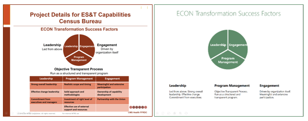
Tip 6 | tier information
Think about what you’d like the reader to look at first, second, and so forth. Then, use varying font sizes, color, and contrast to draw their attention to items in the order you’d like. Take advantage of cultural norms such as the fact that English speakers view documents left to right and top to bottom. 
The org charts above illustrate layering. The org chart on the left uses a very small font size for the title, making it one of the last things a reader sees. Conversely, the org chart on the right uses a large and unique font along with a vibrant header to draw the reader’s attention to the title first. Secondly, the reader’s attention is drawn to the boxes with “FT” and “TD” denoting fulltime employee and temporary detailee. The layering continues into the lighter-colored boxes with the name of the individual displayed in bold, black font and in capital letters. Hence, the reader is guided through the visual.
Tools
Below is a hyperlinked list of free tools you may apply to crafting your message and drafting the visual concept. The list includes two writing tools to help you craft a message that is concise, simple, and direct. For graphic design and drafting visuals, the list includes a photo editor, a database of beautiful and visual templates, websites for when you need to be inspired, and archives for fonts, photos, and even icons. We have found these tools to be user-friendly. We use them on a regular basis and hope you can find some success with them too. And did we mention that they’re free?!
| TOOL | DESCRIPTION | TOOL TYPE | KV STEP |
| Adobe Color CC | Discover appealing color schemes and pallets. | Color | Draft Concept |
| Canvas | Database of beautiful templates (e.g. flyers, posters) | Templates | Draft Concept |
| DaFont | Assortment of free fonts. | Font | Draft Concept |
| Noun Project | High-resolution icons. Please either pay or give credit to creators. | Icons | Draft Concept |
| Icon Finder | High-resolution icons. Please either pay or give credit to creators. | Icons | Draft Concept |
| Search for infographics or charts for inspiration. | Inspiration | Draft Concept | |
| Google Images | Search for infographics or charts for inspiration. | Inspiration | Draft Concept |
| Gimp | Free software editor. | Photo Editing | Draft Concept |
| Unsplash | High-resolution, copyright-free photographs. | Photos | Draft Concept |
| Morguefile | High-resolution, copyright-free photographs. | Photos | Draft Concept |
| Free Images | High-resolution, copyright-free photographs. | Photos | Draft Concept |
| Google Images | High-resolution, copyright-free (use advanced search function) photographs. | Photos | Draft Concept |
| Pexels | High-resolution, copyright-free photographs. | Photos | Draft Concept |
| Minto Method | Organize your ideas and make them easier for readers to grasp. | Writing | Craft the Message |
| BLUF | Facilitate rapid decision making by stating your conclusions first. | Writing | Craft the Message |
Thank you for taking the time to read our blog series. We hope it has left you with a new appreciation for communication and a feeling of inspiration to create beautiful visuals that enhance the likelihood of successfully transferring knowledge to your audience.
Diego Velasquez is a Business Strategist at the MITRE Corporation who specializes in knowledge visualization and knowledge management. He has a Master’s Degree in Business Administration from George Mason University. He is a certified Strategic Planning Professional with the Association for Strategic Planning. Prior to joining MITRE, Diego worked in the financial services industry in a variety of positions, including branch manager, loan officer, and loan modifier.
Josef Kauzlarich is a Business Strategist at the MITRE Corporation who specializes in knowledge visualization. He has a Master’s Degree in Business Administration from the University of Maryland University College. He is a certified Strategic Planning Professional with the Association for Strategic Planning. Prior to joining MITRE, Josef worked in business marketing.
See also
Knowledge Visualization Part I: Recognizing the Value of Empathic Delivery
Knowledge Visualization Part 2: Awakening Your Sleeping Artist
Knowledge Visualization Part 3: How We See and Why It Matters
© 2017 The MITRE Corporation. All rights reserved. Approved for public release. Distribution unlimited. Case number 18-0149
The MITRE Corporation is a not-for-profit organization that operates research and development centers sponsored by the federal government. Learn more about MITRE.