
Knowledge Visualization Part I: Recognizing the Value of Empathic Delivery
Herbert Simon wrote that “What information consumes is rather obvious: it consumes the attention of its recipients. Hence a wealth of information creates a poverty of attention, and a need to allocate that attention efficiently among the overabundance of information sources that might consume it.” How to discipline attention is too large a subject for one blog post, so the authors have wisely focused us on why it’s necessary for us and the people we serve. They’ve also suggested that we consider a possible solution: knowledge visualization. This post is the first of four installments of their series on knowledge visualization. Look for subsequent articles in October and November 2017 and January 2018. — Editor
Icon credits: Llisole and Randomhero from the Noun Project
Authors: Josef Kauzlarich and Diego Velasquez
Have you ever been distracted by an email notification, smartwatch haptic, advertisement, social media article, funny cat video, a noise, or another person? We have (especially the funny cat videos). These types of information constantly barrage us, limiting our ability to focus on any one activity for an extended period. This impairment occurs as we switch our cognitive focus from one information source to the next very quickly. Most of us refer to this switching as multitasking, which is easy to say, but in fact, we are horrible at it. We humans are capable of rapid linear processing but rapid switching diminishes the cognitive resources that can be devoted to any one activity or idea. This makes us less able to distinguish between relevant and irrelevant information for decisions we make because of the wealth of information available to us [1].
As we ourselves are personally overwhelmed by information, so, too are our customers, who struggle to decipher what information is relevant for daily decisions in today’s information-rich environment. As knowledge workers, whose primary aim is to aggregate, analyze, and share valuable information for decision making, we can either contribute to the problem or be part of the solution. While we have no control over the full spectrum of information our customers receive, we do have control over what information we deliver and how we deliver it.
When we deliver work products to customers, they are better received when we put thought and effort into making the information accessible to a target audience that is in information overload. Yet we, the authors, have observed the exact opposite. While researchers, consultants, engineers, and other knowledge workers appear to put an incredible amount of effort into ensuring that their methods for generating knowledge are sound, many often seem to place very little effort into the packaging and delivery of this work. Instead of creating a customized product that displays only the information that an audience is likely to deem relevant, they often deliver enormous technical documents that are mentally burdensome to understand. This bulk delivery always disengages our customers.
Because information and advice are nearly always a key component of the products and services we deliver, we need to ensure that our customers can use what we deliver without feeling frustrated. How, then, might we engage our audiences and increase the likelihood that they will benefit from the information and advice we deliver? One discipline that we believe can help is knowledge visualization.
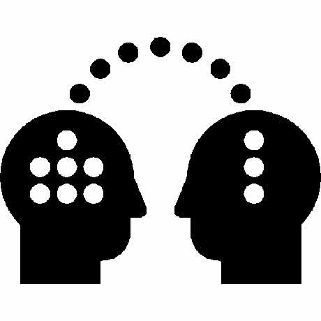
Burkhard defines knowledge visualization as a means of using visual methods for transferring knowledge from one person to another [2]. We (Josef and Diego) think of knowledge visualization as the combining of two disciplines: knowledge communication and graphic design. Knowledge communication is the art of taking the knowledge we produce and crafting a message for a specific audience. That message considers who and where they are, what language they like to use, and the communication mediums they appreciate most. Graphic design then integrates the well-established rules for structuring information visually, to place emphasis and attention on the vital parts of that message. In essence, knowledge visualization is a delivery method that provides precise messaging with a visual emphasis. While you might expect us to focus on the visual aspects of this practice in a post about knowledge visualization, it is more important that you first realize that knowledge visualization requires us to place as much value on knowledge delivery as we do on knowledge generation.
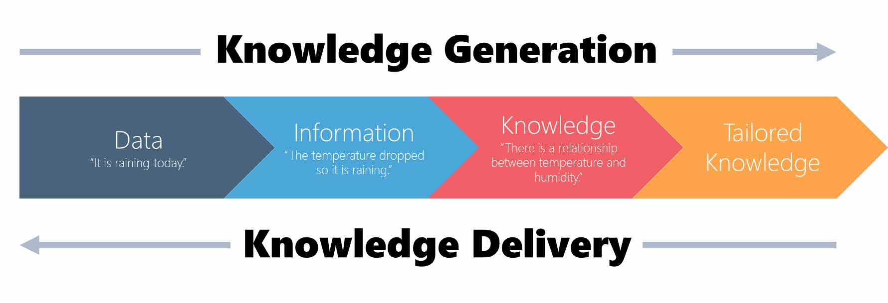
Knowledge is generated by a process that starts with an abundance of information that narrows as we transform it into knowledge useful for decision making, enhancing understanding, or creating awareness. This process is a journey that each knowledge worker goes on to answer questions, to create solutions, and to develop recommendations. It is only natural to want to share that journey with our audience because we feel it lends credibility to the product we are delivering. Yet the problem is that in sharing the journey, we can lose the audience in the details we spent months poring over. The temptation is to give much more information than the audience may need by presenting observations in the same way we generate them. It is much better to think about delivery occurring in the exact opposite direction by starting with communication of the high-level messages and gradually providing more detail, even down to the observational data if necessary.
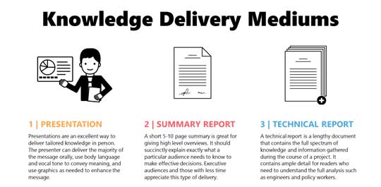
This doesn’t mean that no one is interested in our details. What it does mean is that our knowledge is likely useful to multiple audiences who are interested in different components depending on their needs. Therefore, we need to spend much more time thinking about our audiences’ needs and which delivery medium transfers the knowledge they need most effectively.
The bottom line is that the knowledge we generate is useless if it doesn’t transfer into the minds of people who can make decisions based on it. Therefore, knowledge workers should spend a significant amount of time focusing not only on the production of knowledge but also on its delivery.
Be on the lookout for our September post, which will focus on the benefits of exercising both the logical and creative halves of the human brain.
Sources
[1] Levitin, D. J. (2015, January 18). Why the modern world is bad for your brain. Retrieved June 22, 2017, from https://www.theguardian.com/science/2015/jan/18/modern-world-bad-for-brain-daniel-j-levitin-organized-mind-information-overload
[2] Burkhard, R. A. (2004). Learning from architects: The difference between knowledge visualization and information visualization. In Information Visualisation, 2004. IV 2004. Proceedings. Eighth International Conference on IEEE., 519–524. https://doi.org/10.1109/IV.2004.1320194
Josef Kauzlarich is a Business Strategist at the MITRE Corporation who specializes in knowledge visualization. He has a Master’s Degree in Business Administration from the University of Maryland University College. He is a certified Strategic Planning Professional with the Association for Strategic Planning. Prior to joining MITRE, Josef worked in business marketing.
Diego Velasquez is a Business Strategist at the MITRE Corporation who specializes in knowledge visualization. He has a Master’s Degree in Business Administration from George Mason University. He is a certified Strategic Planning Professional with the Association for Strategic Planning. Prior to joining MITRE, Diego worked in the financial services industry in a variety of positions, including branch manager, loan officer, and loan modifier.
See also: Knowledge Visualization, Part 2: Awakening Your Sleeping Artist
© 2017 The MITRE Corporation. All rights reserved. Approved for public release; Distribution Unlimited. Case Number 17-2840
The MITRE Corporation is a not-for-profit organization that operates research and development centers sponsored by the federal government. Learn more about MITRE.
0 Comments