Flying Friendlier Skies: Turning Raw Meteorological Measurements Into Meaningful Visualizations that Can Advance Aviation Safety

If you’ve ever experienced weather-related turbulence while traveling on a plane, you know it can be a frightening experience. Understanding how weather events impact air operations can help pilots avoid potentially dangerous situations. The MITRE Corporation’s Center for Advanced Aviation System Development (CAASD) is working with the Federal Aviation Administration to employ knowledge-sharing principles and technologies to help aviation analysts do just that.—Editor
Author: Karen Fleer
In their continuing quest to keep us all safe up there, the Federal Aviation Administration (FAA), commercial air carriers, and other aviation safety stakeholders often need to dig into the reasons behind meteorologically impacted operations at a specific airport on a chosen day. For example, they might be researching factors affecting general airport operations or gathering the details needed to reconstruct the story of a single flight, often following an incident or accident. Leveraging deep aviation operations knowledge and long-standing partnerships across the FAA and related entities, MITRE’s Aviation Safety Analysis team of Kurt Etterer and Keith Campbell developed a tool for FAA analysts and airline participants. Their work was recognized at the May 2016 MITRE Knowledge Advantage Showcase.
Before MITRE took to the analytical skies, textual and tabular airport meteorological data originated from a variety of data providers via a variety of non-standardized processes. The data was presented in myriad non-collating formats unsuited for analytical operations: pattern detection, trend identification, and outlier tracking. In short, it was a lot of information, which made it hard to digest. The Airport Daily Overview Tool (ADO) transforms raw meteorological measurements and hard-to-decipher data into meaningful visualizations needed for better decision making and critical incident analyses.
ADO gathers, computes, standardizes, stores, manages, and presents airport meteorology data via a series of interactive dashboards and graphs. Its user-friendly interface can display up to 12 months of data for 700 United States commercial airports—giving analysts the ability to quickly see and understand meteorological data visualizations for any one of the airports on any date contained within the archive. ADO also enables trends visualization via its month view so experts can correlate days that are operationally challenging with the weather. Users can view an airport’s convective weather up to a 50-mile radius or can zoom in to extract data for an individual runway.
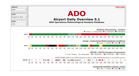
Here’s a real-life example of how data visualization can help find answers. The graph below shows all meteorological data related to Birmingham-Shuttlesworth International Airport in Birmingham, Alabama, at the moment in August 2013 when an Airbus A300 cargo aircraft crashed:
Aviation safety analysts who reviewed the graph see a cloud layer at 1,000 feet and a temperature/dew-point convergence—and can hypothesize that the two features together may have contributed to the accident. Their analysis is corroborated by the National Transportation Safety Board (NTSB) investigation, which lists as one cause “the flight crew’s expectation that they would break out of the clouds at 1,000 feet above ground level due to incomplete weather information.”
Weather affects our lives in ordinary and extraordinary ways, and air travel is just one of them. Having 45 U.S. airlines use ADO is helping the FAA learn from past weather conditions to make future flights safer.


0 Comments