
Heading for a More Mobile-Friendly Intranet

Marcia Nunes’s post on mobile-friendly headers is a good reminder that ease of use is not magic, that human factors specialists are central to user experience, and that MITRE takes their counsel seriously.—Editor
Author: Marsha Nunes
Providing a consistent user experience across a corporate intranet can be challenging, given the variety of content providers and platforms. As a human factors engineer, I’m particularly sensitive to user experience. One way MITRE provides some familiarity to users wherever they are on our intranet (which we refer to as the MII) is our Header:  The Header is a small bar at the top of each page that offers:
- A visual cue that you’re on the MII (vs. the MITRE Partnership Network, which has its own header)
- Access to our most heavily used searches
- Popular links, including our intranet homepage and timecard application
The design and implementation of the Header has evolved over the past 10 years as web technologies and our branding have changed. Once MII access became available from mobile devices, it was time to reimagine the Header again. The new Header design provides the same functionality as prior versions but has different interactions. Search fields now slide out to fit within limited space without adding extra clicks. Being able to use a slide out within an include also opens up new possibilities. To start, we’ve added a menu of additional searches: 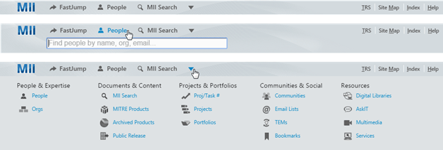
On smaller screens the Header reduces the search options to icons and hides some of the less frequently accessed links:
We handle scaling using Responsive Web Design, a popular approach we’re advocating and employing to make more of our intranet mobile-friendly. Instead of creating separate mobile and desktop sites, we have one site that adapts to optimize its layout and appearance for a range of screen sizes.
MITRE’s public web site, www.mitre.org, is a great example of responsive design. Visit it on different devices or resize your browser window to see how it adjusts. Our next steps for the Header include getting more sites to upgrade to the new version and gathering additional feedback. Changing something so familiar is always tricky, but we’re encouraged by the positive reaction many users have had to the new design.
How have you approached making your intranet mobile-friendly? Do you have any lessons learned from redesigning familiar and frequently used websites?
© 2016 The MITRE Corporation. All rights reserved. Approved for public release. Distribution unlimited. Case number 16-0194
0 Comments